Same hero section, same three-column feature grid, same rounded gradient buttons, same font pairing the AI defaults to the moment you forget to specify one.
Spend ten minutes on any indie hacker subreddit, and you'll start recognizing the template before you finish reading the headline.
The Reddit tell
I browse those subreddits often, partly out of habit, partly to see what people are shipping. The pattern is impossible to miss. Same navigation. Same structure.
Same rhythm of copy, that particular cadence AI writing falls into when nobody has edited it yet. Nine times out of ten, the top comment calls it out: "this is AI slop."
I feel for the people on the receiving end of that comment. Most of them are launching something for the first time, proud of what they built, and they get met with a dismissal that has nothing to do with whether their product solves a real problem.
I made the same mistakes
I've been in business for twenty years, but as an indie hacker I'm still fairly new. My last company was a SaaS I sold, and back then I wasn't the one designing it.
I hired people who knew what they were doing. Vibe coding is the first time I've had to direct that work myself, and my early instructions were bland.
I told the AI to build a landing page without telling it what made the page mine. No references, no constraints, no point of view. So I got what everyone gets: the default.
That's not a failure of the tool. It's what happens when the instructions are generic. Ask for nothing specific, and you'll receive the average of everything the model has seen, which is, by definition, what everyone else is also receiving.
It's not the crisis people make it out to be
I've made peace with it. For an early product, that sameness doesn't matter at all.
Users open your site to find out if you solve their problem. They're not evaluating your navbar. A generic layout that converts beats a beautiful one nobody uses, and generic layouts convert precisely because they're generic. Yeah, the irony in all of this.
Familiar patterns lower the cognitive cost of a first visit. Nobody has to relearn how a pricing table works just because you decided to reinvent it.
This isn't a new phenomenon either. Every wave of tooling has produced its own visual monoculture. Bootstrap sites all looked alike. Then Tailwind sites all looked alike.
WordPress themes put an identical layout under millions of businesses, and plenty of those businesses did just fine. iOS apps share interface conventions on purpose, and users reward that consistency instead of punishing it.
AI-generated design is just the newest entry in that cycle, banking and building on the patterns that already work rather than experimenting for its own sake.
Most startups don't fail because their cards had the wrong corner radius. They fail on distribution.
Read also: Indie Devs ignore SEO, and they shouldn't
Investors don't pass on a deal because the landing page resembles three other SaaS tools they saw that week.
Customers compare price, features, trust, and support before they ever compare visual originality, and once you have product-market fit, a redesign is one of the easier problems you'll solve.
There's also another point worth making: the average visitor cannot tell a page was AI-generated, and most developers wildly overestimate how much users notice design at all.
The place people spend their time and form their opinion of your product is the dashboard, not the homepage. Every hour spent tuning a hero section is an hour not spent talking to a customer, and at the earliest stage, talking to customers is the higher-leverage use of that hour.
There's a limit where it stops being fine
None of that means it stays fine forever, and this is where I'd push back on myself. Looking generic becomes a real cost once:
Your brand starts to feel forgettable rather than familiar.
You're selling to a design-conscious audience who reads visual quality as a signal of product quality.
Your copy reads as common with every other AI-assisted launch, so there's no distinct voice underneath the layout.
Design is part of the product's value, as it is for creative tools, agencies, or anything positioned as premium.
You never circle back to invest in identity once the product has proven itself.
So the honest position isn't "generic is fine." It's "generic is fine at the start, and it stops being fine the moment you have evidence people want what you built."
What changed when I slowed down
When I went back to redesign a few of my other projects, I gave Claude and Cursor far more to work with. I wasn't writing one-line prompts anymore.
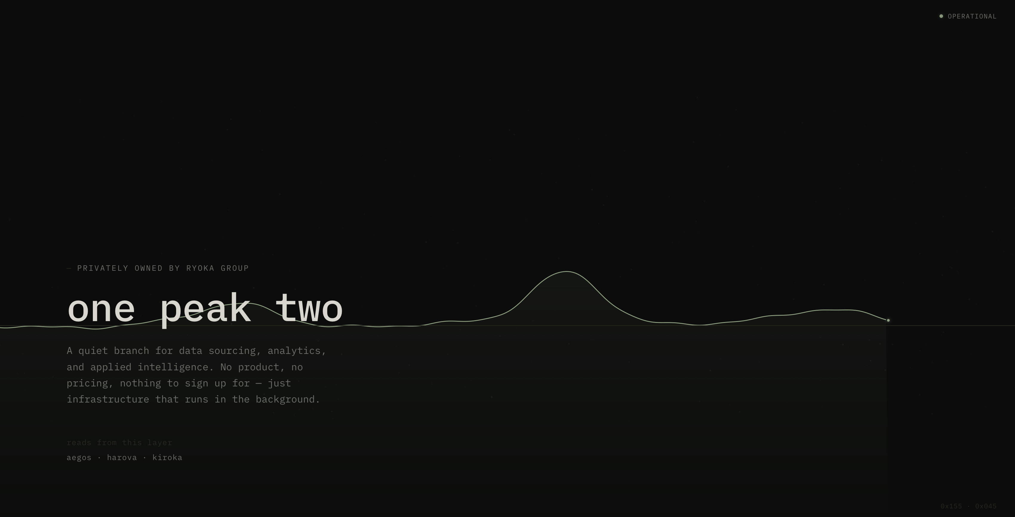
I was writing entire novels of direction: what I wanted the page to feel like, who it was for, what I didn't want it to look like. The output changed accordingly. Claude picked up on the preferences faster once I gave it something to actually latch onto.
None of it required a from-scratch visual identity. This blog design is still AI-assisted end to end, and it doesn't read as a stock template, because of a handful of deliberate choices layered on top:
A signature in the footer that shows up on every page
A wireframe-style homepage that leans into the aesthetic solo builders already recognize and trust.
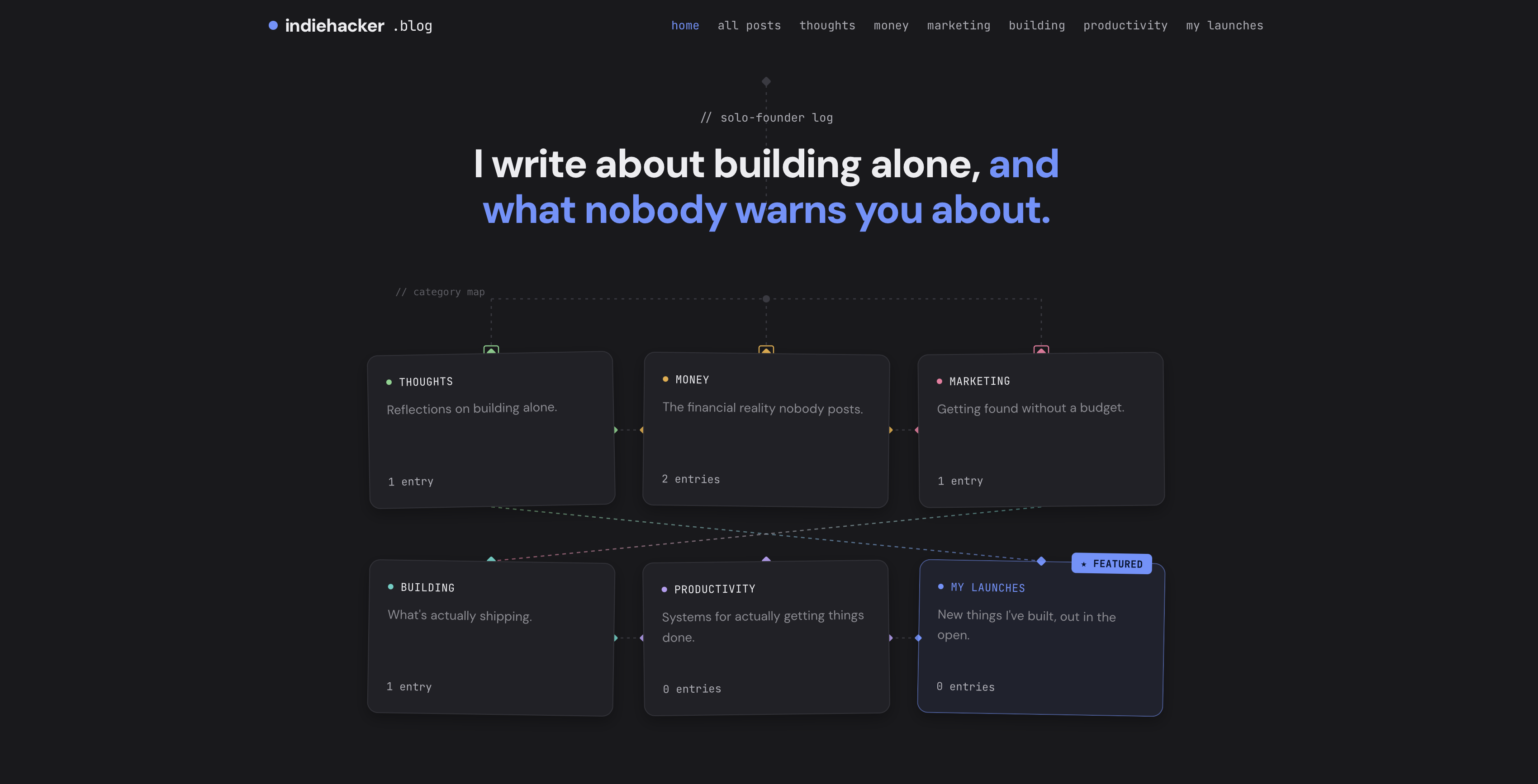
Small, specific decisions. Not a redesign. The differentiation came from a few details, not from abandoning the defaults.
That tracks with what separates one AI-built product from another once you look past the surface. It's rarely the gradient or the illustration style. It's the copywriting, the specificity of the voice, the sense that a person with a point of view is behind the page.
Performance, accessibility, and whether the thing simply works reliably will do more for you long-term than any visual trend.
If you're just starting out
If you're new to this and someone has already called your project AI slop, don't let it sit with you longer than it deserves to. I can promise you that everyone's first vibe-coded site looks rough, because the tools default to averages until you teach them otherwise, and that takes reps.
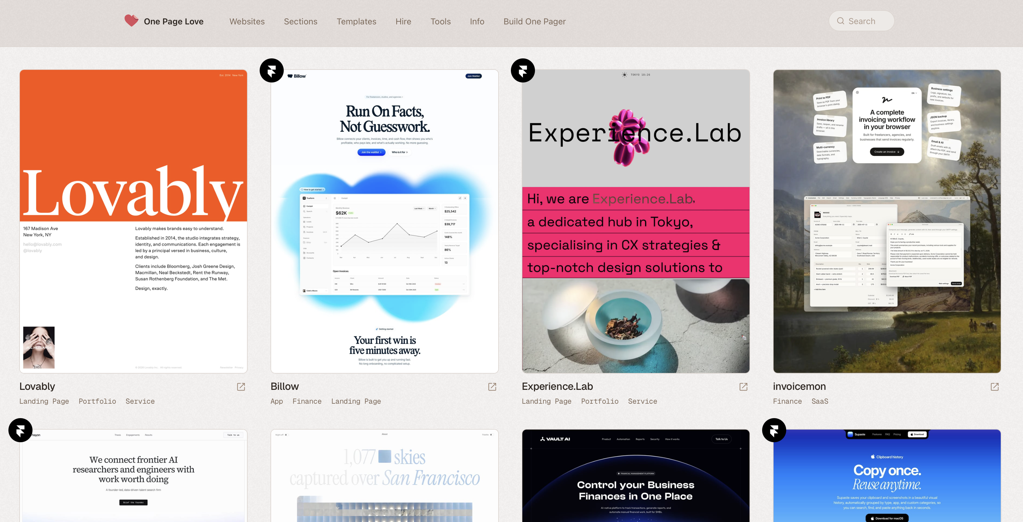
Read a bit about UX fundamentals. Feed your prompts real references instead of vague adjectives. Browse Dribbble, OnePageLove, or SaaS Landing Page for examples of what a considered layout actually looks like, then point your AI agent at the specific details you want borrowed, not just "make it nice."
Treat the first version as exactly that: a first version. The people shouting "AI slop" in the comments are usually reacting to the surface, not the substance, and most of them started in the same place you did. Iterate, get more specific with your instructions, and let the site earn its own identity over time. It doesn't need one on day one.